Preparing the product for a large traffic campaign, pinpointing user issues, and resolving them.
Preparing the product for a large traffic campaign, pinpointing user issues, and resolving them.
Preparing the product for a large traffic campaign, pinpointing user issues, and resolving them.
Preparing the product for a large traffic campaign, pinpointing user issues, and resolving them.
Discover ↓


(001)
Our primary goal was to prepare the product for a large traffic campaign, pinpoint users' primary pain points, and address them within a tight 3-month deadline. The main challenge lay in executing these changes swiftly, while optimizing our limited development resources.
Our primary goal was to prepare the product for a large traffic campaign, pinpoint users' primary pain points, and address them within a tight 3-month deadline. The main challenge lay in executing these changes swiftly, while optimizing our limited development resources.
Our primary goal was to prepare the product for a large traffic campaign, pinpoint users' primary pain points, and address them within a tight 3-month deadline. The main challenge lay in executing these changes swiftly, while optimizing our limited development resources.
Project
GoMining®
Year
(2023)
Services
UX Review, User Research, Interface Design
UX Review, User Research, Interface Design

Summary
What's been done in the project?
What's been done in the project?
What's been done in the project?
✦ Conducted competitor analysis.
✦ Analyzed user feedback from support.
✦ Conducted interviews with users to identify the target audience.
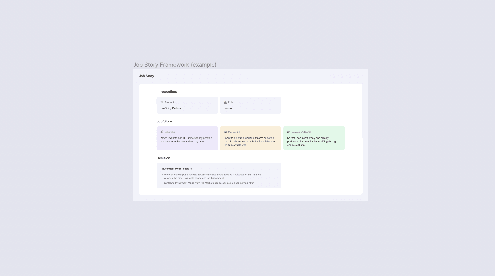
✦ Used the Job Story framework following user interviews.
✦ Conducted A/B testing of the first new concepts.
✦ Improved onboarding and added an onboarding checklist, leading to increased NFT purchases.
✦ Designed new wireframes for the web version of the NFT marketplace.
✦ Prototyped and presented new concepts to stakeholders.
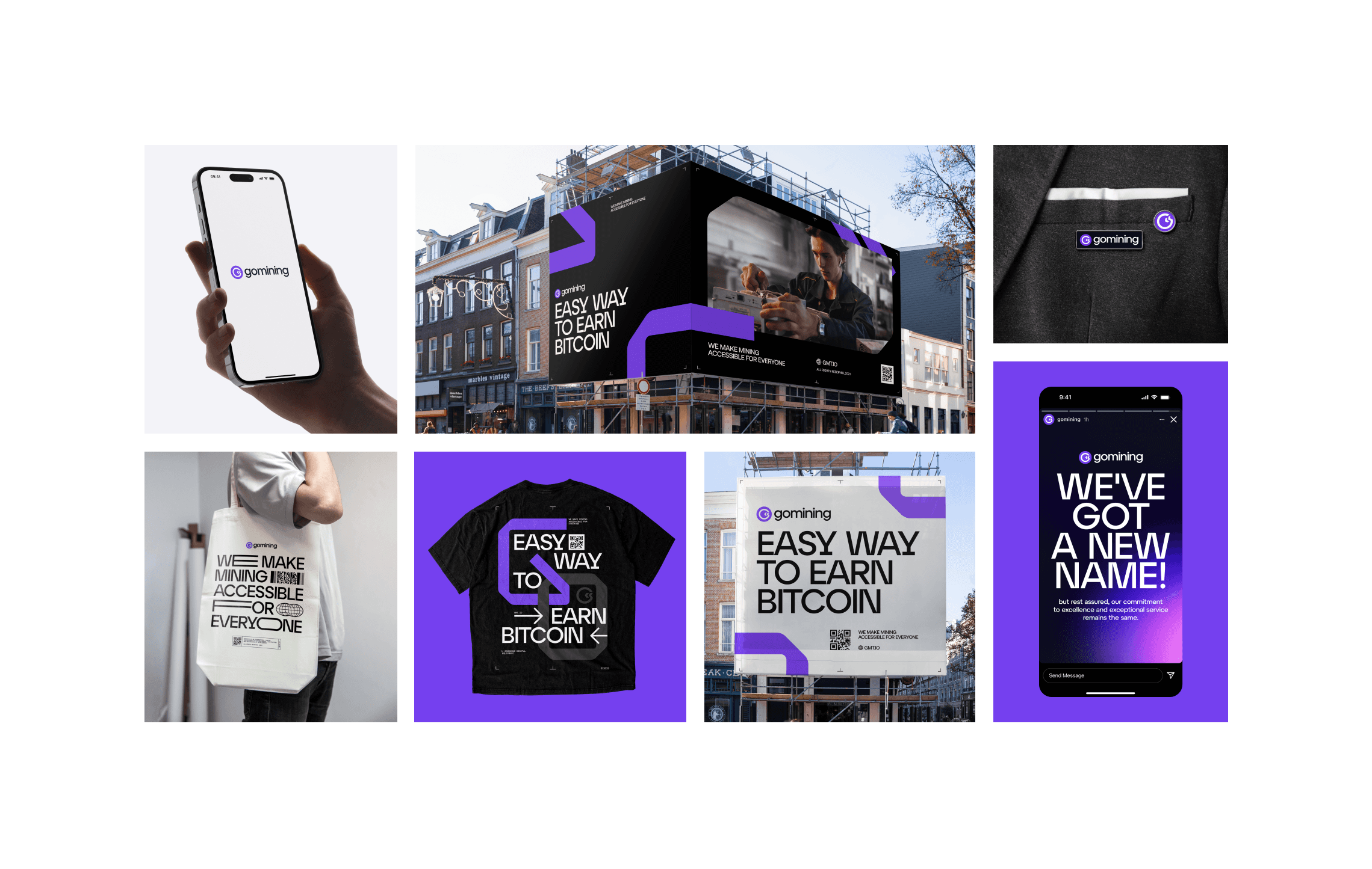
✦ Updated the logo, and all marketing materials, including landings, newsletters, and banners.


Overview
Identifying key problems in the experience
Identifying key problems in the experience
Identifying key problems in the experience
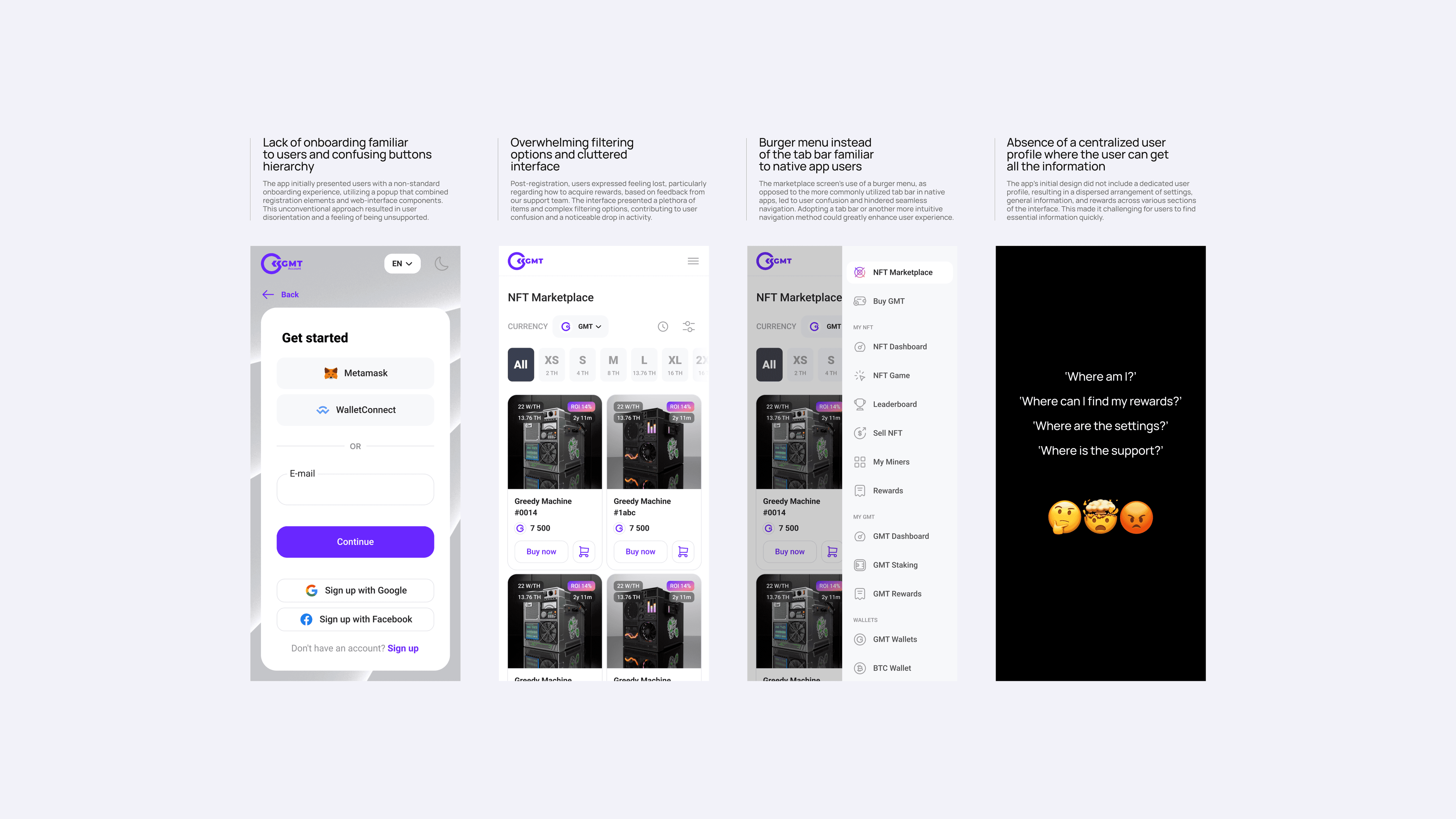
The mobile application was implemented as a webview, essentially replicating the mobile version of the web service. Feedback from our support team highlighted numerous complaints about the app's usability, mostly related to unfamiliar UX patterns.
For example, rather than using the conventional tab bar, the app utilized a burger menu on the marketplace screen, leading to confusion and impeding easy navigation. Also, the app lacked standard onboarding features, presenting users with an unconventional popup containing registration and web-interface components, leaving many feeling disoriented and unsupported.
Approach
Working with the design system and improving user flow
Working with the design system and improving user flow
Working with the design system and improving user flow
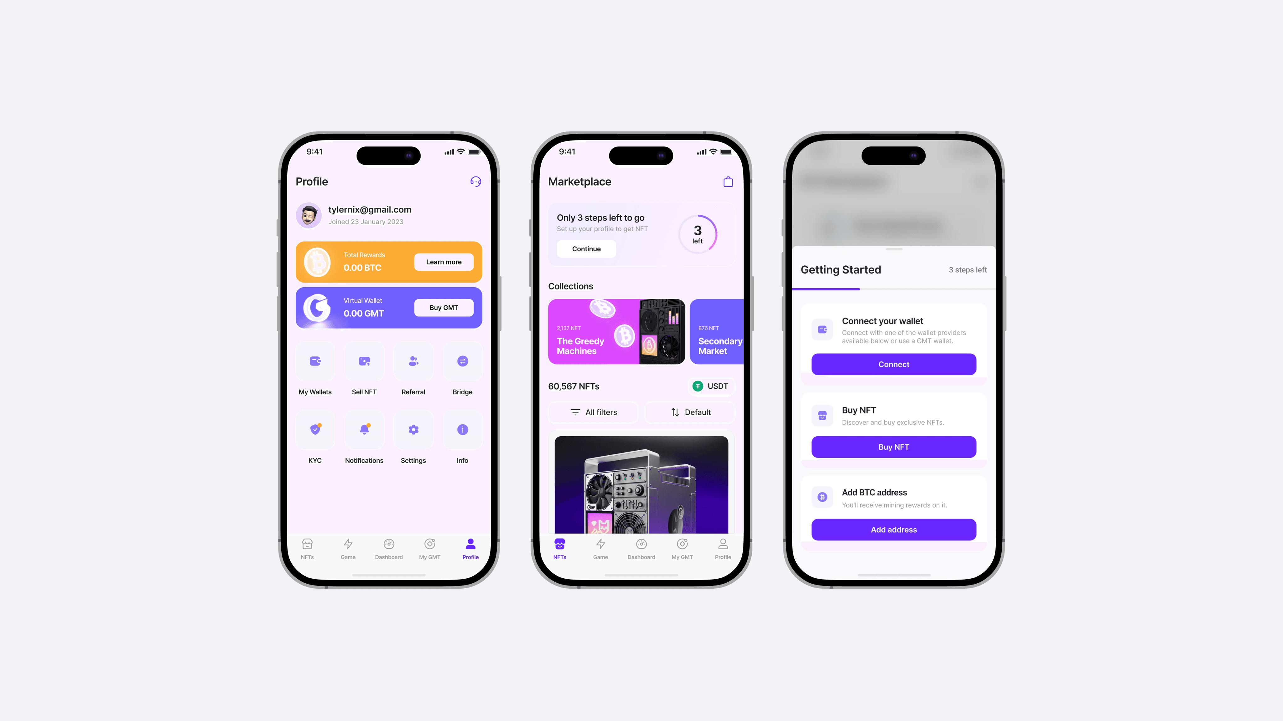
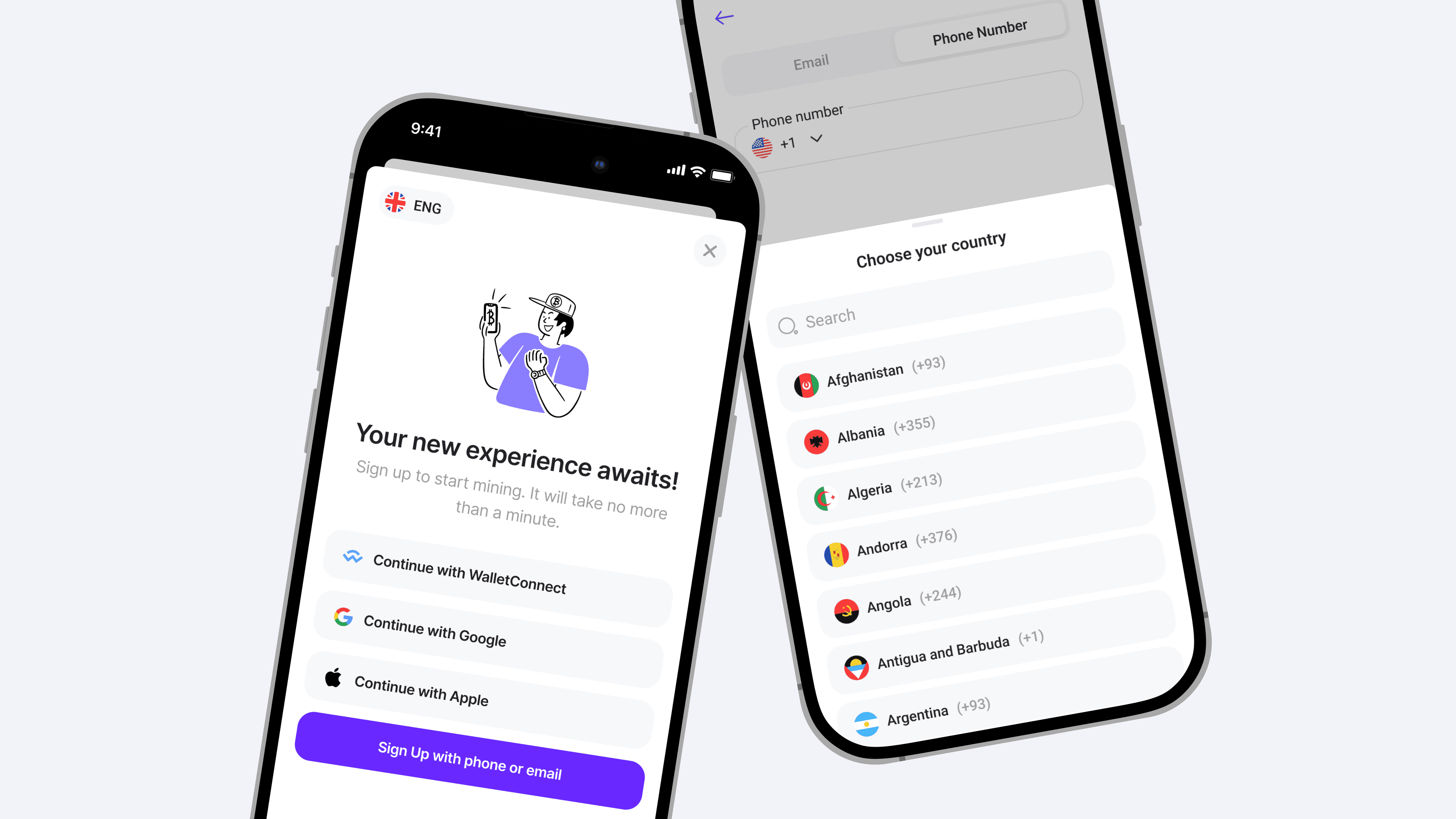
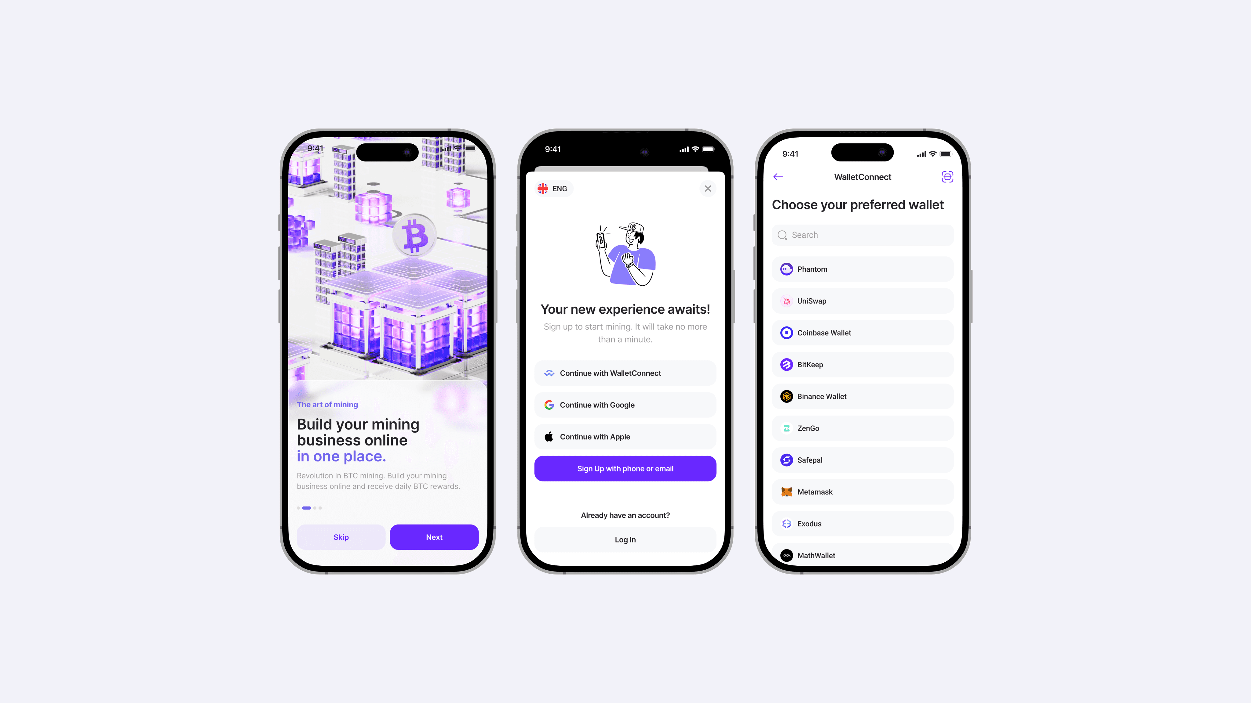
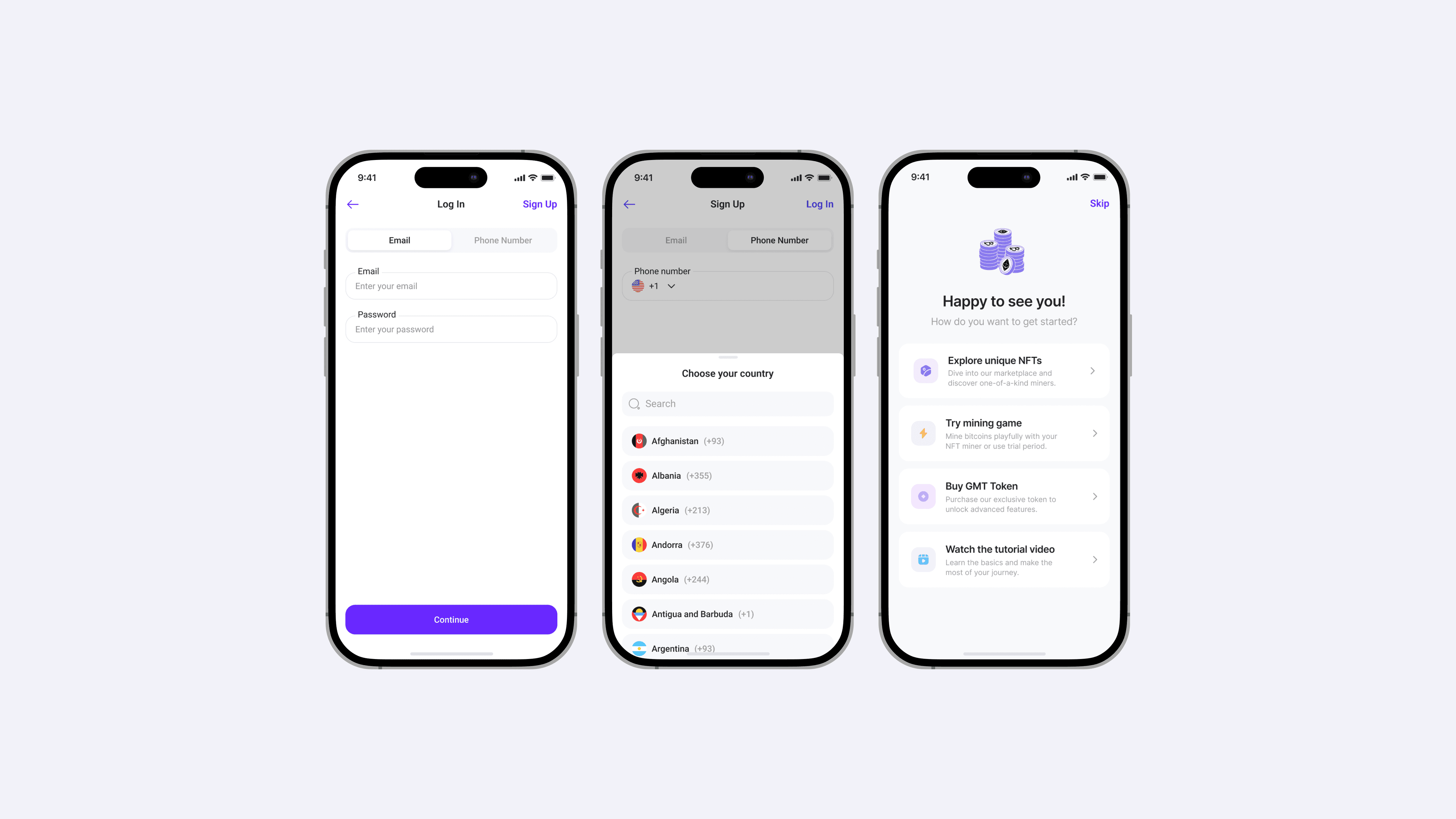
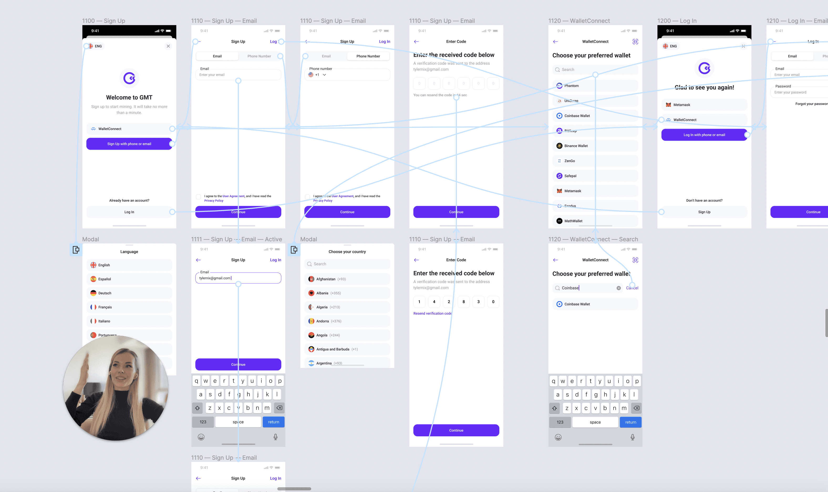
I emphasized aligning with our existing design system and refined its components. We developed user-friendly onboarding screens, registration interfaces, and other app screens. We incorporated key UI elements familiar to users, including the tab bar, action sheets, segmented filters, modal views, and alerts.
Most importantly, we built upon existing screens, enhancing navigation by integrating new components. This optimization allowed us to use development resources more efficiently, fast-tracking the introduction of new features.
Following these changes, we noticed a significant increase in positive user feedback and increased LTV.
Following these changes, we noticed a significant increase in positive user feedback and increased LTV.
Following these changes, we noticed a significant increase in positive user feedback and increased LTV.
Following these changes, we noticed a significant increase in positive user feedback and increased LTV.



Overview
Redefining app navigation: addressing user profile and reward access challenges
The initial design of the app lacked a dedicated user profile, leading to a scattered arrangement of settings, general information, and rewards throughout the interface. Consequently, users found it difficult to access essential details.
Our support team's feedback also highlighted that many users felt directionless after registering, especially concerning reward acquisition. Their confusion often resulted in reduced activity post-registration.
Further complicating matters was our need to address these issues within a tight deadline, ensuring compatibility with the app's webview display.
Overview
Redefining app navigation: addressing user profile and reward access challenges
Redefining app navigation: addressing user profile and reward access challenges
The initial design of the app lacked a dedicated user profile, leading to a scattered arrangement of settings, general information, and rewards throughout the interface. Consequently, users found it difficult to access essential details.
Our support team's feedback also highlighted that many users felt directionless after registering, especially concerning reward acquisition. Their confusion often resulted in reduced activity post-registration.
Further complicating matters was our need to address these issues within a tight deadline, ensuring compatibility with the app's webview display.
Approach
Creating easy navigation, a user profile, and step-by-step checklist
Creating easy navigation, a user profile, and step-by-step checklist
Creating easy navigation, a user profile, and step-by-step checklist
To enhance user navigation, we incorporated a tab bar component into our existing design system. This facilitated the creation of a centralized user profile tab, consolidating crucial information.
We also segmented the interface visually, streamlining navigation to existing app pages. This interface update enriched the user experience without demanding significant development time.
To tackle the post-registration confusion, we added a step-by-step checklist to the marketplace screen.
Post this intervention, we noted a significant boost in user engagement and purchase conversions. Sales increased 3 times: this is due to changes in the business strategy as well as product improvements. New navigation has been designed based on testing and understanding technical constraints.
Post this intervention, we noted a significant boost in user engagement and purchase conversions. Sales increased 3 times: this is due to changes in the business strategy as well as product improvements. New navigation has been designed based on testing and understanding technical constraints.
Post this intervention, we noted a significant boost in user engagement and purchase conversions. Sales increased 3 times: this is due to changes in the business strategy as well as product improvements. New navigation has been designed based on testing and understanding technical constraints.
Post this intervention, we noted a significant boost in user engagement and purchase conversions. Sales increased 3 times: this is due to changes in the business strategy as well as product improvements. New navigation has been designed based on testing and understanding technical constraints.
